Working in Grasshopper (2/4)
Component display
Once you place a component on the canvas, you can interact with it in several ways:
Tooltips (hover)
Hovering over the inputs, name, and outputs of a component will give you a tooltip with information about the component and the data stored inside of it. Hovering over any of the input ports will tell you the data type the input is expecting, a description of what this input is used for, and what data is currently being input. Hovering over the component’s name will give you a description of what the component does (similar to what you see in the component toolbar). Hovering over any of the component’s output ports will tell you the data type that the output generates, and a preview of the generated data.
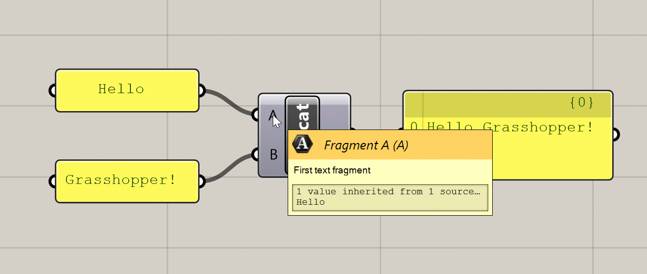
Various tooltips generated by hovering over a component
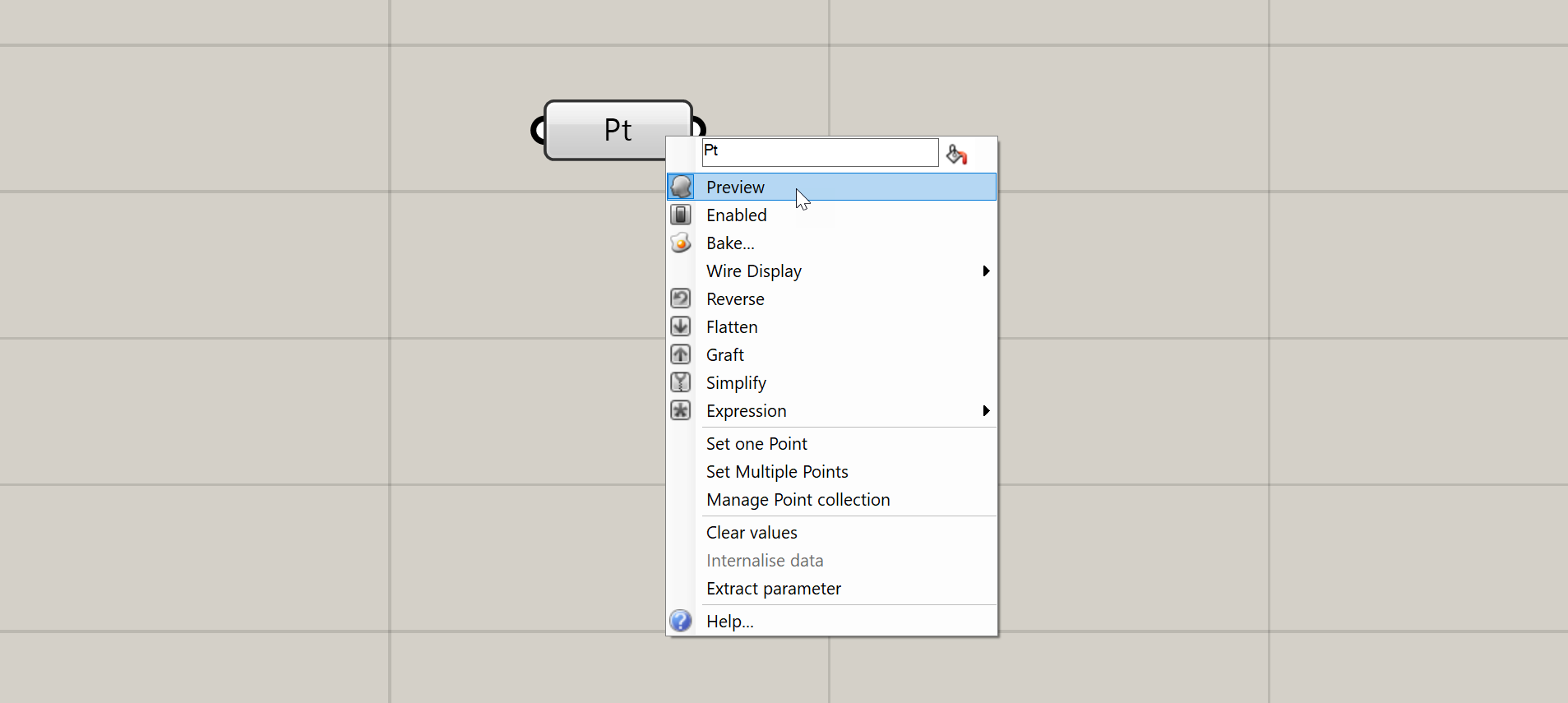
Context menus (right-click)
Right-clicking on the inputs, name, and outputs of any component will give you options pertaining to that input, output, or component as a whole. I will not describe all of these options here, but we will encounter them over time as we proceed through the exercises.
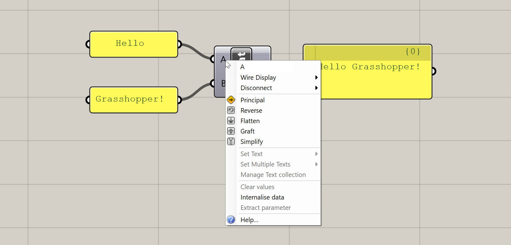
Context menu generated by right-clicking on a component’s input
Zoomable UI
This is a recently added feature of Grasshopper which adds additional UI elements to some components based on the level of zoom in the canvas. The additional features you get with the zoomable UI depends on the type of component, but the most typical uses are adding and removing input and output ports for components that support it, and setting styling and display options within Panel components.
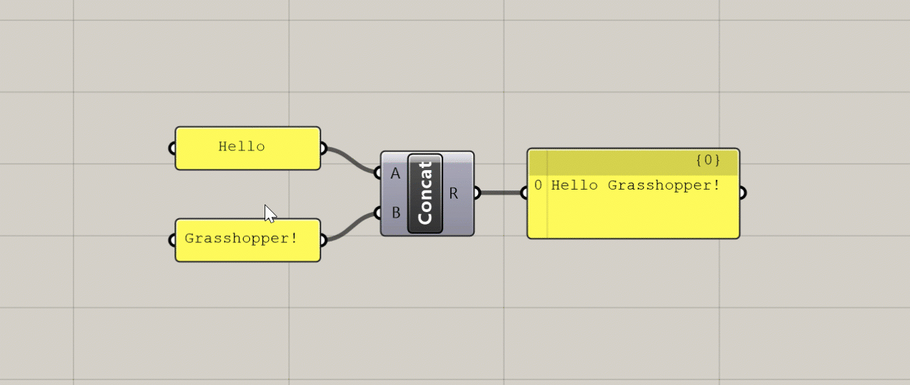
Additional UI elements generated at close zoom
Component States
The color of the component on the canvas indicates its state. There are six possible states for a component, each with its own visual representation:
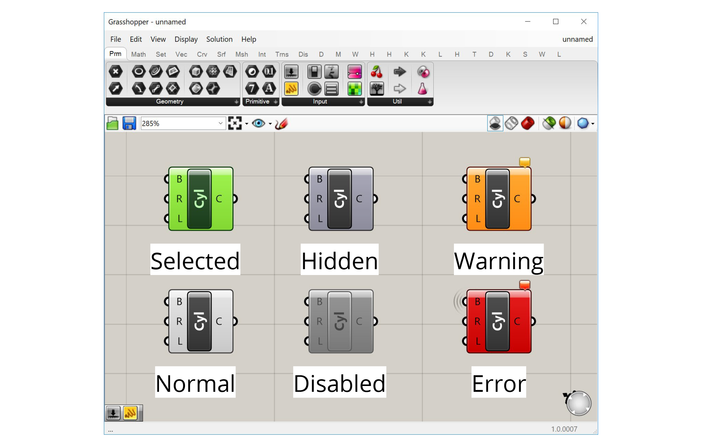
Normal
This is the default state. The component is shown in the default white color, and any geometry generated by the component is displayed in the Rhino viewport in a semi-transparent red color.
Selected
When you click on a component or use a selection window to select it, the component will turn green, as will the geometry generated by the component in the Rhino viewport.
Hidden
If you don’t want the geometry generated by a component to show up in the Rhino viewport, you can hide it by right-clicking on the component and de-selecting ‘Preview’ in the context menu. The component will turn a darker grey and its geometry will no longer be visible in Rhino. This is very useful as you start building more complex definitions to hide geometry that is needed by the definition but does not need to be seen.
Disabled
If you want to stop a component from running you can disable it by right-clicking and de-selecting ‘Enabled’ from the context menu. The component will turn completely grey, and be stopped from running, which will likely stop other components which rely on its outputs from running as well. This is useful for turning off entire sections of your definition, for example when trying to isolate a problem or temporarily disabling a part of the definition that takes a long time to compute.
Warning
If there is a non-critical issue with the component that does not completely prevent it from running, the component will produce a warning and turn orange. This usually happens if you have not supplied any data to an input that requires it, or something went wrong with a particular input that did not prevent the rest of the inputs from being processed. You can see the warning by hovering over or left-clicking the bubble in the component’s upper right corner.
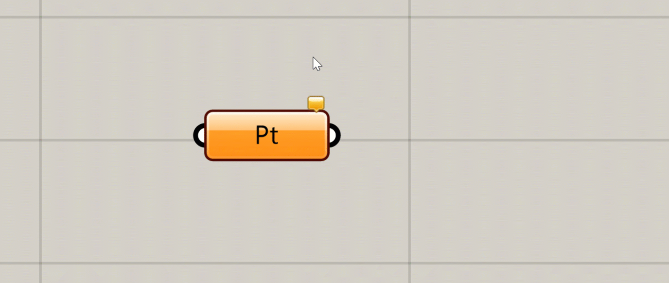
You can see a warning or error message by hovering over or clicking on the bubble
Error
An error is similar to a warning, but an error is more critical, usually meaning that the component failed completely and did not generate any outputs. If a component has an error it will turn red. As with a warning, you will see a small bubble on the component which will give you more information about the error.