Working in Grasshopper (4/4)
Navigating the canvas
Most of Grasshopper’s interface is focused on the canvas, which is where you compose your definitions by laying out the components and connecting them with wires. Working in the canvas should be pretty intuitive for anyone used to working with digital design tools, but let’s spend some time looking at a few of it’s more advanced features which will speed up your workflow and allow you to get the most out of Grasshopper.
Context menus
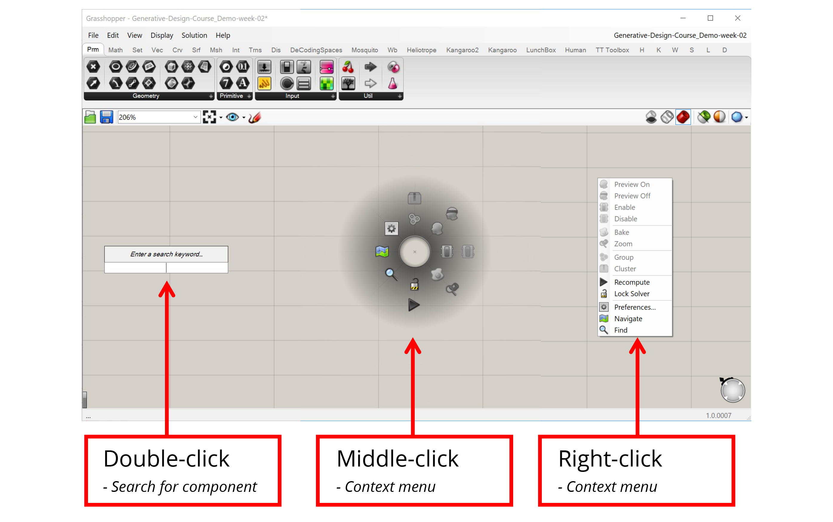
Clicking on an empty part of the canvas will bring up a set of context menus that will help you select components and access common options faster.
- Double-clicking on the canvas with the left mouse button brings up the component search bar. Once the search bar pops up you can start typing the name of the component you want to create and the search bar will present the closest matches from the components you have loaded. You can then press Enter to select the closest match, scroll through the matches with the arrow keys, or select from the matches with the mouse to place the chosen component on the canvas. As long as you know the name of the component you want to create, the search bar can be a very quick way to find it.
- Clicking on the canvas with either the middle or right mouse button brings up a context menu that allows you to select from a set of common options. For example, if you have a set of components selected you can control their visibility or turn them on and off all at once. You can also use the context menu to group components and create Clusters, as well as control the execution of the definition itself. For example, you can lock the definition to keep it from running or force it to recalculate. The middle and right mouse button menus contain the same exact options but organized a different way, so you can use whichever one you think is more convenient.
Grouping and Clustering
Groups and Clusters allow you to work with sets of components. To create a Group or Cluster, you must first select a set of components, which you can do by either holding down Shift and clicking on them one by one or by using the left mouse button to click and drag a window around the components you want to select. Once the components are selected, you can use the context menu to create a Group or Cluster.
When you create a Group, Grasshopper will place a new Group object around the selected components. You can then select this object to move all the components in the Group at once. You can also right-click on the Group to select all the components inside as well as add and remove components from the Group. You can use the shortcut ‘Ctrl+G’ to create a Group as well.
When you create a Cluster, Grasshopper takes all the selected components and places them inside of a new component. Any wires leading to the components become the inputs of the new Cluster component, and any wires leading out become the outputs. You can think of this as creating your own custom components out of a set of other components. To edit the components in the Cluster you double-click the Cluster component, which brings up a separate canvas showing the components inside. Once you’re done editing you can save your changes and go back to the main definition canvas.
Clusters are especially useful when you have a set of components doing a specific task that you reuse often within the same definition or between definitions. Once you define a Cluster, you can copy and paste it within your definition or into other definitions. Copies of Clusters act as instances, meaning that when you edit a Cluster and save changes, the changes are updated in every instance of that Cluster. With Clusters, you can start to define your own library of specialized components without knowing any code. We will discuss Groups and Clusters in more detail later in the course.
Widgets
Widgets are extra UI elements that appear on the canvas in certain instances. You can see what widgets are available and turn them on and off in the main menu under ‘Display → Canvas Widgets’.
- The Align widget appears when you select two or more components. This widget helps you lay out the components more evenly on the canvas and can be a great tool for keeping your definitions visually organized.
- The Profiler widget is turned off by default, but if you turn it on you will see a balloon under some components that will tell you how long the component took to execute. This can be very useful for troubleshooting and optimizing more complex definitions. Like most UI elements in Grasshopper, the Profiler balloons appear only at certain zoom levels, and only for components that take more than a few milliseconds to calculate.
Profiler balloons appear below components that take longer to execute as the amount of data passing through them increases.
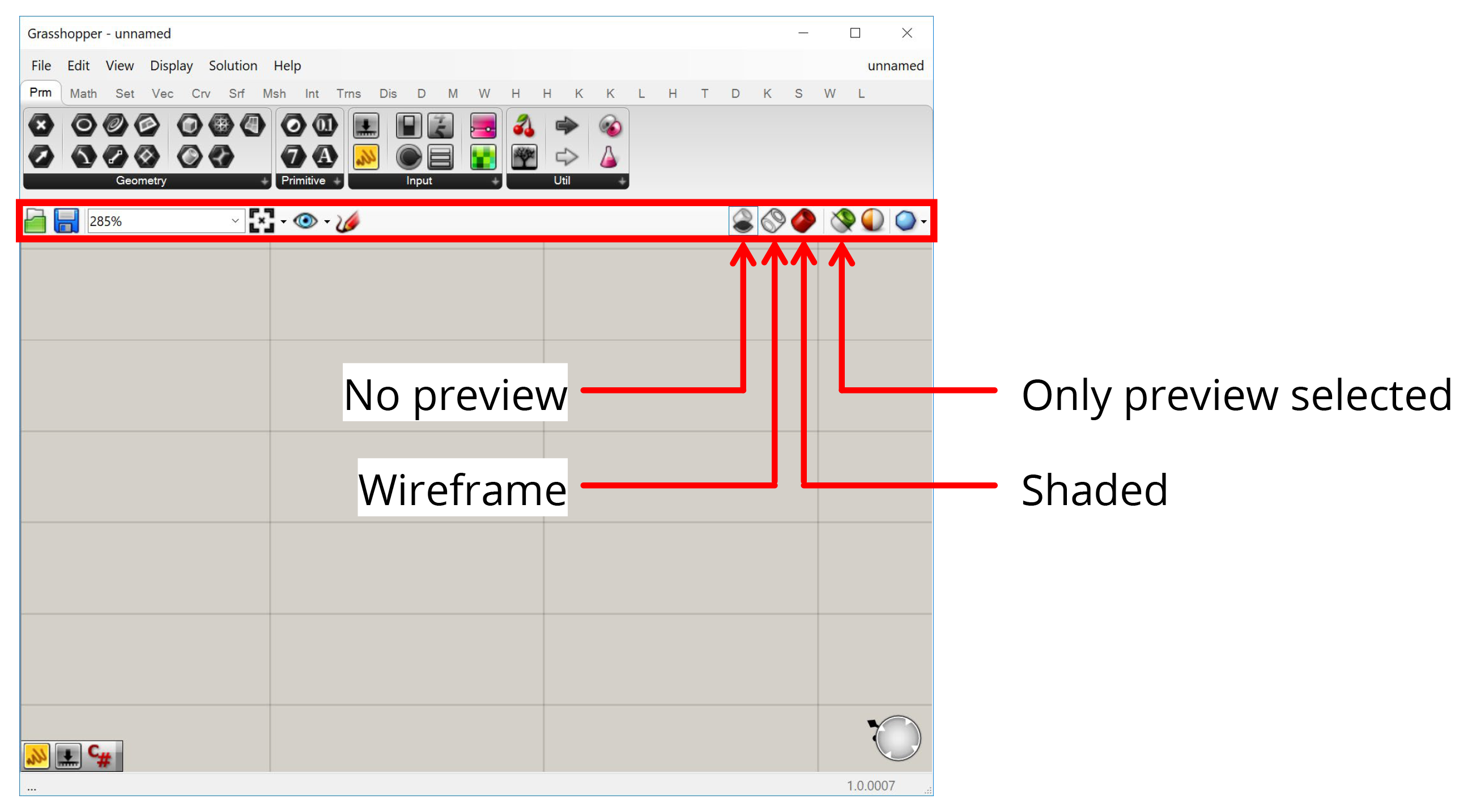
Canvas Toolbar
Between the component toolbar and the canvas there is a toolbar with options for the canvas. The most important things here are the buttons on the right which control how your Grasshopper geometry is previewed in Rhino. The first three buttons give you global control to preview all geometry in Shaded or Wireframe mode or turn it off completely. The fourth button makes it so that only geometry contained within selected components is visible. This is useful for figuring out what each component is producing when troubleshooting a definition or learning how it works.
Conclusion
In this lesson, we looked at the two basic elements common to all Grasshopper definitions: components which define a set of operations, and wires that connect the components together. Using these two elements, we can start to represent complex design systems by first breaking them down into a set of smaller interrelated parts, and then building out the relationships between them in the Grasshopper canvas.
We learned some additional features that help us work in the Grasshopper canvas. In the next lesson, we will continue with our hand-on exercises to construct one of the most classic examples of computational design — a parametric tower!